Design language
Brand
Vision and principles
Simple and elegant solutions, tools that do one thing well. Minimalist approach with clean forms framing complex content: “less, but better”Terminology
Avoid a posteriori terminology unless the subject is technical and the target audience will comprehend. Business/agency lingo should be avoided (eg. “below the fold”). Make good use of hypertext for clarity.Logo, and usage guidance
The logo is the white rose of Yorkshire so should always be monochrome and unaltered.
On the website the logo should only exist as a small motif in the standard footer. In homegrown mobile apps the same bottom left aligned placement should be used on any splash or about screen. Never use the logo in a header or as part of main content. Never use the logo as a main feature, it's intended as a consistent detail across output, not as any kind of centerpiece statement.
There shouldn't be any need to use raster iconography in modern development. Always use the vector image.
User experience guidelines
Native mobile
Adhere to native interface guidelines but favour newer interactions that take into account the larger screen sizes of modern devices. Use bottom navigation and bottom sheets for modals/dialogs. Where possible the top half of the screen should be used only for native navigation (the back navigation arrow for example; experienced users will use gesture navigation, but standard patterns cater for all users).Never use a right arrow/chevron for list items except on iOS. This was a ui element created for the original iPod that utilised a physical jog wheel to navigate. It was carried over onto iPhone and designers have since been adding it by habit onto the web and Android.
The triple bar icon is a good way to signify a menu interaction, but not as used originally on Android (the so-called burger menu at the top left of the screen is out of reach on modern phones with large screens). The triple bar has been used as a menu icon since the original wimp experiments at Xerox PARC in the 1980s.
Design tokens
Colour
Eigengrau grey: #1d1d1d (blue reduced from the definitive value)
Off white: #efefef
Accent red: #ff473a
Accent grey: #666666
The above colours pass WCAG 2.0 level AA contrast and colour requirements.
Dark and light mode
Layout
Units, Grid, and breakpoints
Use 4 point increments: 4, 8, 12, 16 ...
Desktop content is 720px and centered horizontally, this makes a comfortable line length for reading. On web use a 2em horizontal screen margin, reducing to 1em on mobile to reduce unused screen. In general only code media query rules to switch content between desktop and mobile. Tablets should be treated as a desktop. Always stick to a single column on mobile.
The 720px main content scrolls past the lower left footer logo on desktop, this is the key ui pattern of the Öppen brand on desktop web. Once the screen size is less than 720px + footer width the footer should become opaque and full width so content scrolls underneath.
Keep layouts simple, a single column will work well for most of Öppen's ouput. Avoid parallax and other gimmicks, and don't override any default browser navigation behavior (there should never be a reason to listen for content scrolling).
Typography
IBM Plex Sans, an open source typeface developed by IBM to replace Helvetica for internal use.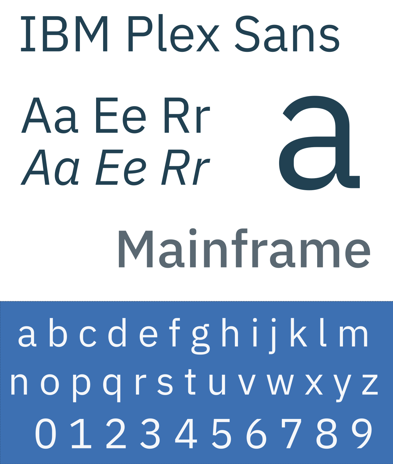
Use weight 400, and never use bold for headers or inline for emphasis:
font-family: 'IBM Plex Sans', helvetica, arial, sans-serif;
font-weight: 400;
font-style: normal;
font-size: 16px;
line-height: 20px;
Web core components
Banner
Appearance
A simple h1 tag that falls outside of the 720px standard width. As with the main content it has a 2em border (1em on mobile)
Banner images and actions
Öppen website header banners should never have images or any menu actions. Any menus will be in the footer (on mobile), or screen bottom right.
Images
Feature images should match the 720px content width, smaller inline images should be 50% at 360px. All images should have well formed alt tags for accessibility, feature images should include a right aligned description using font-size: x-small;
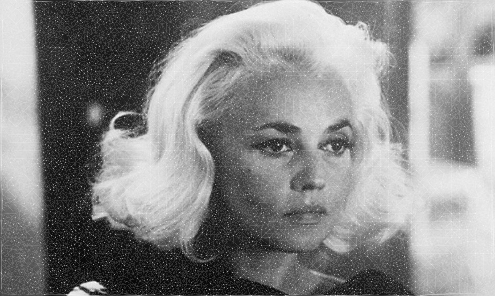 A feature image of the french actress Jeanne Moreau processed using delauney trianglulation